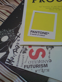
A creative execution here for a self-set brief to create ambient advertising for Pantone. Printed on a durable card then die-cut, the postcards resemble a good ol' swatch except with the centre missing. The simple idea is that the small postcard can be placed on any coloured surface (indoor and out), emphasising that Pantone has a vast array of colour to offer with all it's matching systems and spot-colours. No this is not a paid ad in my blog, just something that I thought would be cool to do (and being a designer, rather a geeky thing to do). Let me know if this idea has already been done however as I'm not sure.


 Boring legal bit: Colour identification is solely for artistic purposes only and not intended to be used for specification. Refer to current Pantone colours for accurate matches. Pantone carries all the trademarks of a regular company blah blah...

Yo.
ReplyDeleteI don't think this has been done before as such, but why do it for Pantone? People who know what Pantone is will already be using it and no-one else will care!
This would be much better for a paint matching service like Dulux or something I recon.