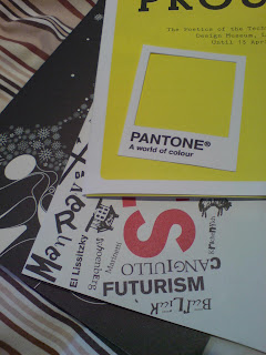
Sunday, 27 April 2008

Mayor of Londoff...new pictures.


After recently visiting the big smoke a for a few days on the trot, the London logo (in which a simple play on the city name and the word 'on' is employed) kept sticking in my mind, maybe because the tube is currently being developed. But it was precisely why the tube was being developed (and subsequently delayed all the time) that I felt the logo didn't feel right. I created my own version by changing the last part of the city name to create an identity that may best sum up the city currently, hopefully these darn re-developments will finish soon. The sticker I made attempted to intrusivly blend in with current posters so that it wasn't automatically ripped off by passers-by, a form of parasitic design. Let me know what you think...


Thursday, 17 April 2008

Did someone say....copy?

After viewing a site that I hadn't done in years, youthoughtwewouldntnotice, and various ad blogs, I remembered that there is unbelievable amounts of copying within the ad industry....blatant copying. It saddens me when I see a brillient campaign, only to see another version of it later on for a different product. If the product being sold is of a completely different nature, then why choose the same execution? If the rational benefit of a product is different, why choose the same emotional benefit? It seems abit of a cop out. There is so much out there to inspire all of us, so many sights to see, smells to smell, sounds to hear, things to touch yet people sometimes rely on other people's creativity. I supose 'all art comes from other art' as my old GCSE art techer once said to me, and to some extent that's true. It may have been only coincidence that the creative executions of these ads were the same (there are hundreds of examples out there), maybe not (I'm not going to point fingers). Life's too short to see duplicates of everything...

Discuss...


The kitkat ad were done by the same agency so I guess that's a valid reason (?)


Legal bit: All ads copywright blah blah

Sunday, 13 April 2008

Badges!

After waiting for a good 14 days, the new i10 badges were plopped through my letterbox. Set in stunning aluminium, these badges are a must for your summer collection, the perfect accessory for that summer frock or tee. Drop me a line if you'd like one (costing zilch-eroony). Also out now are the prototypes for some new i10 stickers, watch this space...

Wednesday, 9 April 2008

Get yer logos out for the lads...

Logotime! Couldn't stay away from my graphic design roots and have designed a few corporate identities (some relevant to my current MA projects) and some included typefaces I designed including ESSType and Round v1.1. In recent times there has been an explosion of logobooks, and more often than not, most of the logos featured are vector-happy muddles (not saying they're bad visually, it's just that they might not be relevant to the values of what they are supposed to stand for). As 'The Art of Identity' (Gower Publishing) puts it...

"Identifying your core beliefs is no easy matter - but identify you must, for if you don't know, how can you expect your market area to know?"

Some of the 'oldskool' books such as ones by Wolff Olins are definitely worth a look at, as well as the one mentioned above, and in defence of the infamous 2012 logo, the guys were trying to predict fashion/trends 5 years ahead of themselves (they got the publicity they wanted though so an inadvertent bonus there). By trying to visually interpret what the logo stands for, the core beliefs of the client are interpreted by potential markets/customers. If you want to infiltrate various markets however, of varying subjects, the logo may take a universal look (mental note: make self more articulate). Enjoy!


Community.

Q, Stylised letterform.
The construction of light.
'NHance', feat The Blokstar Type.
'It's all RGB to me'.
Go in different directions.


Go Further, feat Round v1.1.
Making a 'B-Line'.
Relive, feat the ESSType.
Give me a shout if you've seen these before somewhere and I've subconsciously done a doodoo. I think I heard somewhere that in the UK we're bombarded by 3000+ images a day so that's a lot of subconscious input!

Wednesday, 2 April 2008

iPhoney?

With all the hype and talk about the iPhone in recent months (and various other products beginning with the letter 'i'), there's been an explosion of talk both positive and negative. Forums have dubbed Mac users as 'fanboys' whilst the benefits of owning an iPhone seem vast. On such a forum I stumbled across this movie about Apple's baby, and at first thought it was showing it in a positive light. How wrong I was...


Despite this, I still think Apple has produced a few good products over the years (as well as opening the floodgates to new possibilities in the way commercial media is consumed). Although there are phones out there that previously had Internet capabilities, Apple have produced a 'fashionable' web-phone, but as the saying goes (derived from something similar Oscar Wilde said I think), "Fashion is a fickle business because they seem to change it every 6 months". Discuss...

A World of Colour.

A creative execution here for a self-set brief to create ambient advertising for Pantone. Printed on a durable card then die-cut, the postcards resemble a good ol' swatch except with the centre missing. The simple idea is that the small postcard can be placed on any coloured surface (indoor and out), emphasising that Pantone has a vast array of colour to offer with all it's matching systems and spot-colours. No this is not a paid ad in my blog, just something that I thought would be cool to do (and being a designer, rather a geeky thing to do). Let me know if this idea has already been done however as I'm not sure.


Boring legal bit: Colour identification is solely for artistic purposes only and not intended to be used for specification. Refer to current Pantone colours for accurate matches. Pantone carries all the trademarks of a regular company blah blah...